The art of communication is what gave humanity the ability to express themselves. The simple fact of conveying ourselves paved the way for great successes and is the key to human survival. However, speech isn’t the only way we interact, there are several non-verbal interaction such as expressions, gestures, body language, art and artistic representation. One such means for communication is via design. Design in any form, be it architecture, paintings, graphics or user interface design, is just a mode of conversation. Simpler and more impactful modes of delivery of thoughts are tools that take humanity forward, like the tool of Graphic Design. It has a soaring range and is steadily being used and incorporated in many platforms, encompassing us in many forms, prompting that ‘Design is thinking made visual!’
The term ‘graphics’ is very common and has been heard by almost everyone today. It originated from the word 'graph' which means a visual that is accurate and proper by calculation.
Nowadays more inclination to use graphics is present. Graphics are used on various surfaces like walls, floors, ceiling etc. They not only enhance the space but also modify the whole atmosphere of the space. Graphics give a fresh and quirky appearance to any given space.
Space would look plain and dull without having some character. If chosen thoughtfully, graphics serve to help in stitching the desired character into a space.
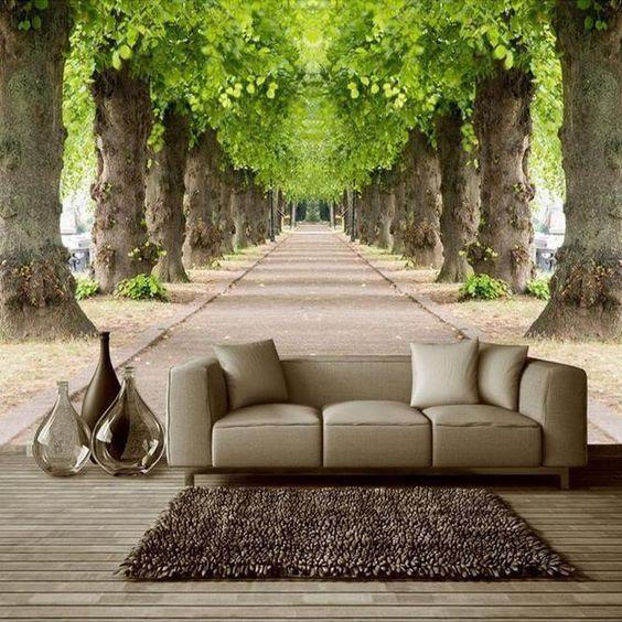
A very inviting feeling is attained through this graphic which is giving a perception of continuity.
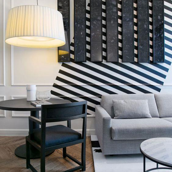
Here, the graphic makes accessories pop from the wall, giving a 3D touch to the room.
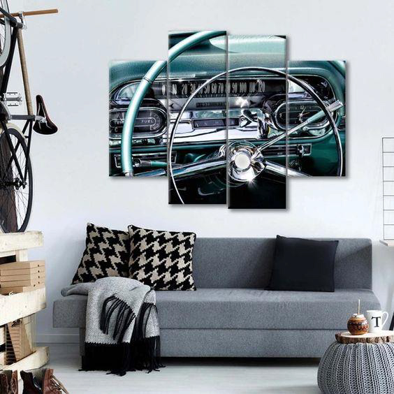
The steering in the antique car portrays control of the surroundings and gives a perception of power.
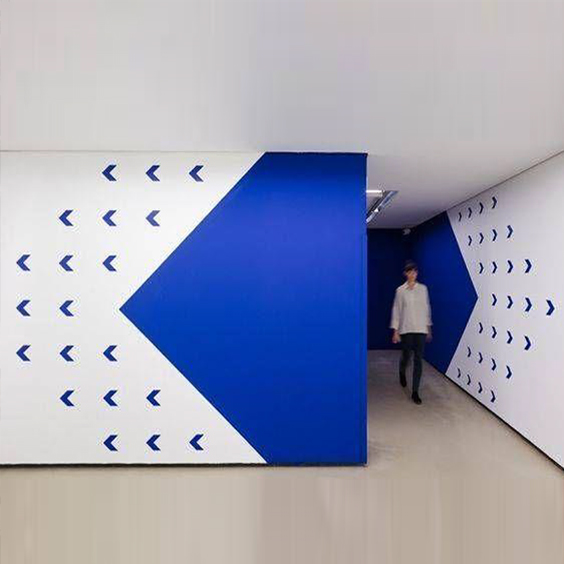
This graphic gives a feeling of movement. It moves the viewer with the use of color and arrows.
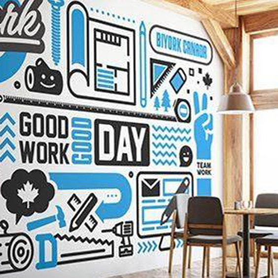
Motivating and productive meeting rooms are desirable in every office.
Effective graphic design improves conversion rates, provide eye-catching branding and helps spread your message to your audience.
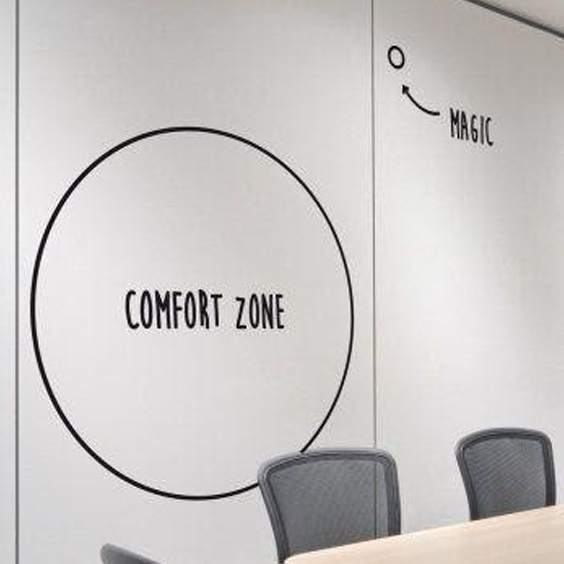
This graphic clearly explains ‘How magic happens’, when one steps out of their ‘Comfort zone’.
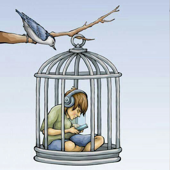
The kid in the graphic is trapped in a bird’s cage, whereas the bird is set free. The kid is unbothered by surroundings and is sunken deep in technology.
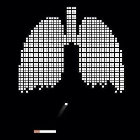
We all must have played the digital game where bubbles are shot from beneath, here a cigarette can be seen as bursting the bubbles, shaped as lungs.

Ethnicities received the certificate from the Guinness World Records Book for the world’s largest graffiti art. They represent both the five Olympic rings and the message ‘we are all one’.
Do you ever think about mood when you are designing? While you can’t always account for the mood of users or their good/bad days, you can create an aesthetic that emphasizes the right mood for your project.
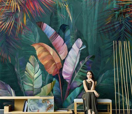
Won’t you instantly crave some Pina colada when you enter a space with such tropical interior graphics?
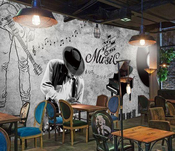
This amazing character of the space seems to be created solely by the graphic in the picture, mood of music peps up the café.
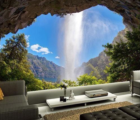
Sense of peace and serenity is brought together with the right graphic. The waterfall adds beauty and with music in the background, it would elevate one's mood.
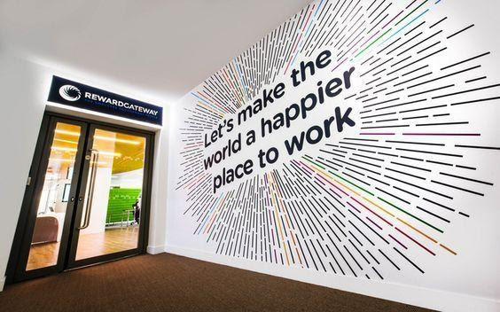
The use of the radiating multi-coloured stripes makes the picture full of life. Entrance of spaces gives the essence about the entire space and the mood.
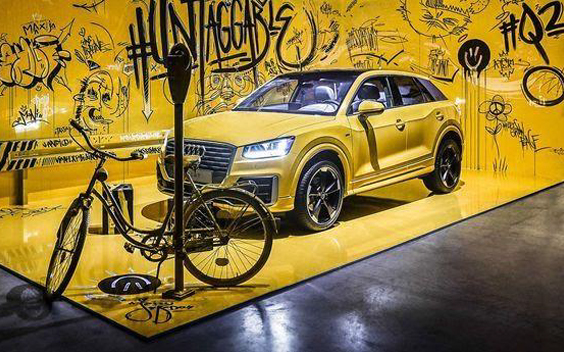
Here, the colour yellow dominates the graphic. The graffiti, distorted ghostly faces and the kind of text face used makes it eerie.
A space can be designed to camouflage with the furniture accessories, floors, wall, props etc. These kinds of space can be attractive and unique. Let’s catch sight of a few examples:
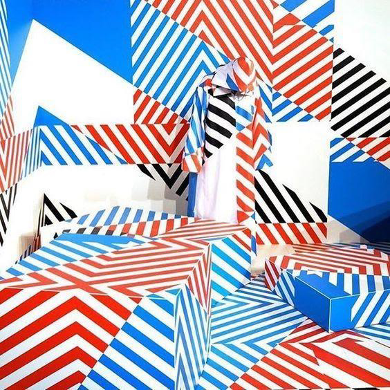
The graphic above has been designed in such a way that it becomes difficult for the viewer to figure out and spot the differences.
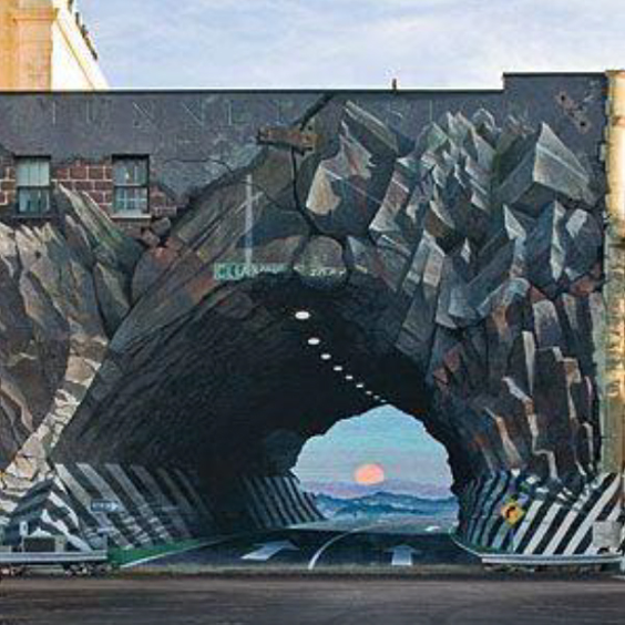
Doesn't this look like you are watching a beautiful sunset in front of rocky mountains? This is an example of how creatively and innovatively one can have graphics outdoors.
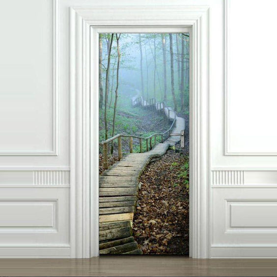
This graphic is mysterious. What could be the actual surface? A wall? A door? Keep guessing guys! ![]()
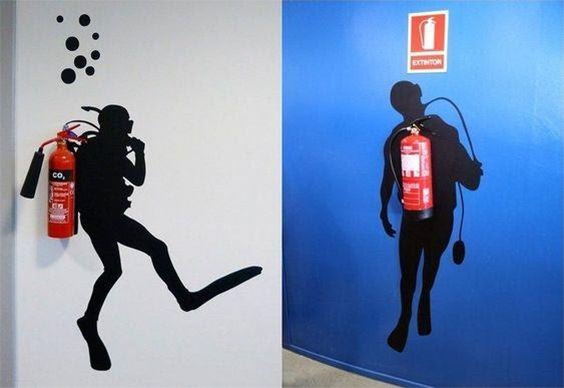
The designer has made the scuba diver carry the fire extinguisher like a pro! These kinds of graphics use materials as props and build around them creatively.
For any company or space, a good brand value and identity is essential. Graphics play a major role in the interiors of such places.
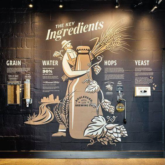
This graphic explains the ingredients used in brewing beer. The beautiful illustration and usage of colours add to the aesthetic beauty as well.
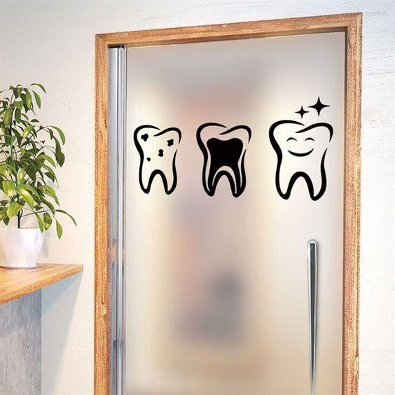
This is a witty graphic used outside a dentist's clinic. The three stages that a tooth is going through is displayed. A simple, monochromatic yet very powerful message is conveyed through this.
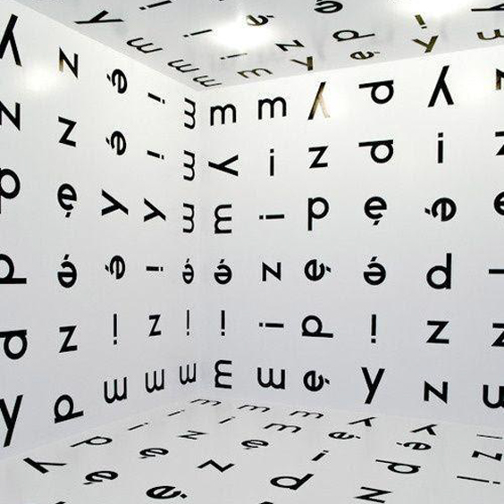
We must have seen eye doctors testing eyesight by showing such alphabets and numbers on the screens. The identity of a place can be portrayed phenomenally in this manner.
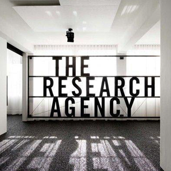
'THE RESEARCH AGENCY' the name of the firm is boldly highlighted and located in such a place that when the sunlight passes through the window and hits the text, and creates an attractive shadow.
Here I would like to twist a very well known brand tag and rephrase it as ‘A lot can happen over a graphic’! There is a lot of scope for graphics to be used as a medium to energize and encourage a person in any given interior space.
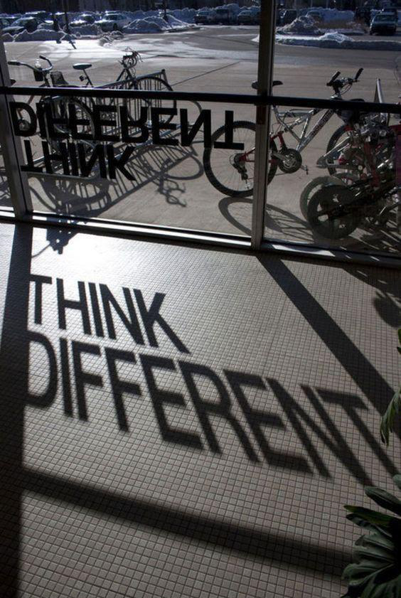
At first glance, when there is no shadow or sunlight, it would be very confusing to decode. These graphics make us use our mind to decode the message.
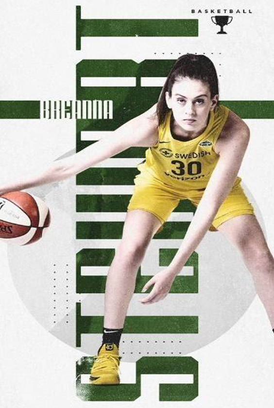
The look in the player’s eyes is strong, focused and determined. The image stimulates us to focus and be strong.
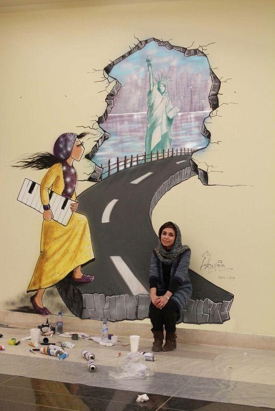
'The Statue of Liberty', the statue here signifies liberation. A girl is about to pass by it.
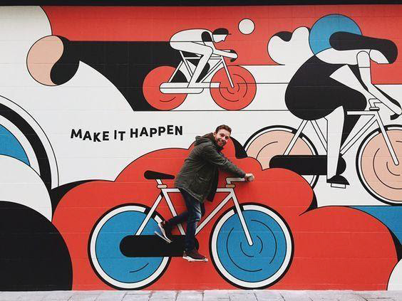
Splendidly illustrated graphic on the exterior wall giving out motivation to 'make things happen'.
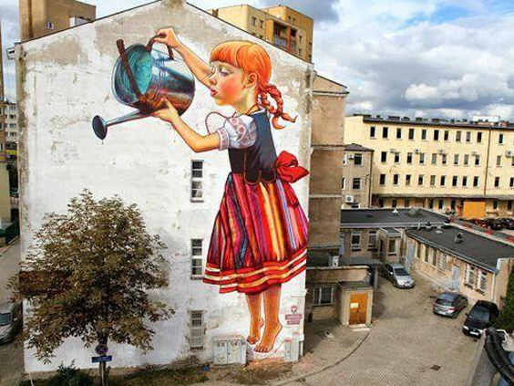
In 21st century, we all are in need of such environmentally conscious graphics.
A plethora of information can be shared with the viewer without making it boring. Pictograms, signage, info graphics, illustration etc. are fun and eye-catching way to let people know about the information you wish to provide.
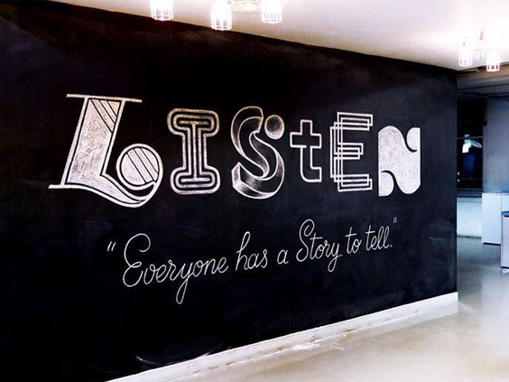
To ‘listen’! Is it that difficult of a task that somebody thought of writing it big and bold on their wall?! I guess it is.
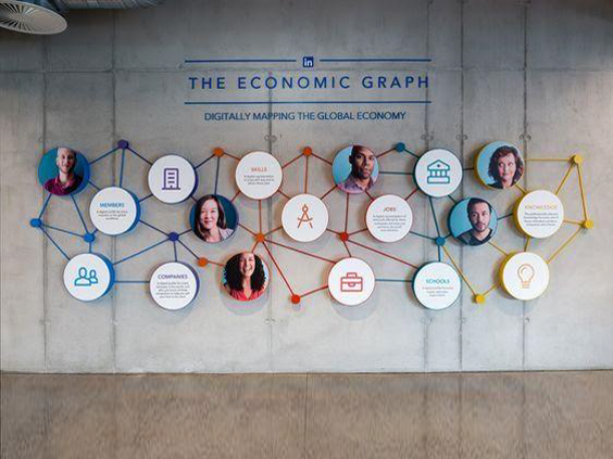
Such graphs and pictograms can be a useful tool in making the information more likely to be read.
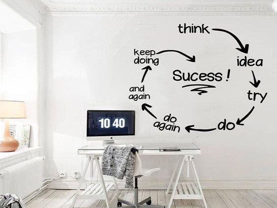
Here the chronology of the process towards success is shown stepwise
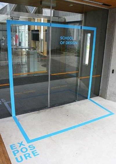
Design schools are places where students with curiosity and creativity are guided and trained to gain knowledge from qualified teachers and learn hands-on materials.
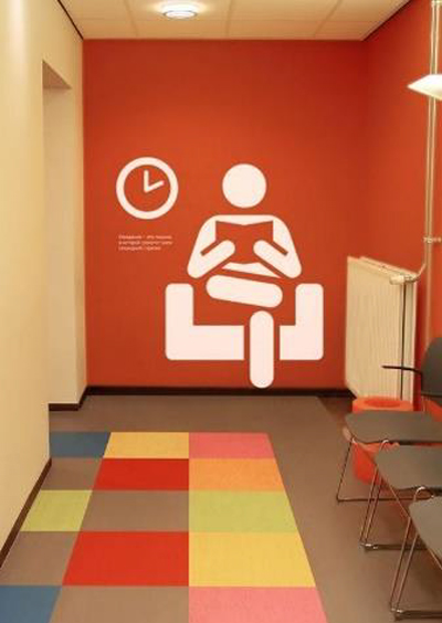
This graphic gives information on the segregation of the space.
There are a lot of times graphics, most of the times pictorially tell the viewer a story, it can either be done by using a series of pictures or by a single picture giving a clear story.
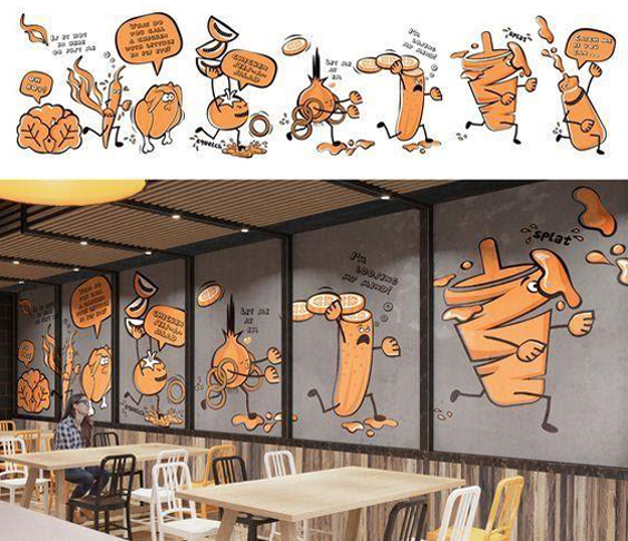
These kinds of graphics usually engage the customers by telling short stories to keep them busy till their order is getting prepared.
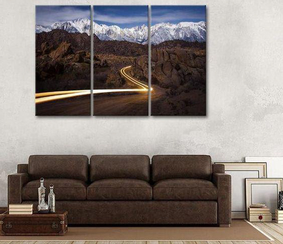
Exquisitely captured an image of the light emitted by the headlight when the car passes from one end to the other. The picture has a zest and it gives the frame a motion in a static picture.

For our sweet desires to be fulfilled these child workers have to go through a lot of struggle.
It is rightly said that ‘To be entertained is to be happy’, If a graphic is engaging as well as fascinating for its viewers, it is appropriately doing it's job. Have a look at such graphics and get entertained!
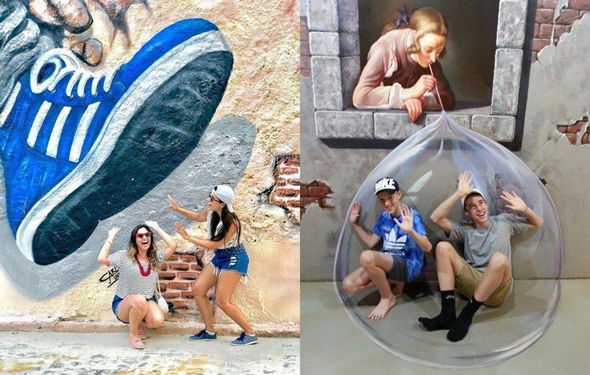
This graphic on the left is of an exterior wall giving a three-dimensional effect. The people experiencing the graphic feel that they are living in the picture.
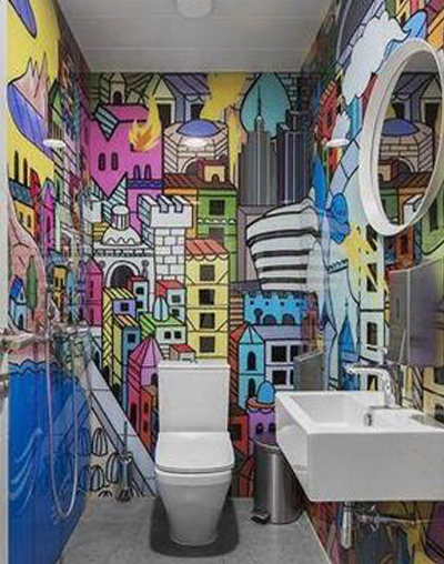
Inside the washroom, there can be various kinds of graphics and at times information or some fun facts are provided to kill the time.
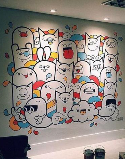
This cute little illustration in this graphic surely entertains, not only kids but adults also won't mind sparing a minute or two to admire it.
I have shared this little blog after going through many Interior projects where graphics are used. I studied the relevance and effects graphics have on a space. Through this blog I have tried to give you a glimpse of the exciting and eternal world of graphics. This goes deeper and wider as one tries to understand and acknowledge it, it’s like a vast ocean. I have shortlisted nine among the various senses graphics can provide to any given space, you might be having more ideas. What other ideas can you add to this list that I may have not mentioned?
As a designer, I would suggest design students or aspiring designers (that’s what you like to be called right :P) to study the spaces you visit, observe the little details, analyze what difference will be created in a space if any accessory or a design element is added or eliminated. Click pictures of showrooms, malls, offices, public spaces where you see graphics. Try to relate and figure out what category of my blog it will fall into.
Joining Synergy Corporate Interiors Pvt. Ltd. has opened various doors for me, both in terms of exposure, and in terms of knowledge. I got the opportunity to work with great minds, write this blog while being exposed to various real-life situations to utilize my understanding. If you enjoyed this blog-post and found it informative, share it with your friends! Do give us your valuable feedback.
Disclaimer : This blog is for informational purposes only and we have relied upon various resources for compiling the content, data and visuals contained in it.